The Modern Way to Build
Interfaces That Move.
Text effects, cursors, WebGL backgrounds and UI with motion built in. Copy a component or install it with the shadcn CLI, and the code is yours.
components/ui
4 installed
all yoursLast installed
@glint-ui/bloom-menu
Built with the tools fast teams already use
- Components
- 0
- Free for any project
- Categories
- 0
- Text to widgets
- File each
- 0
- Nothing to keep in sync
- Themes
- 0
- Light and dark built in
Everything for Smarter Interfaces
Motion that ships fast, stays accessible and costs nothing.
369 Free Components
Text, motion, backgrounds, UI and mascots. Glint included.
Install in One Line
The shadcn CLI does the copying for you.
Component Installed
@glint-ui/frost-tiles
- File
- components/ui/frost-tiles.tsx
- Packages
- None
- Lock-in
- Zero
Everything You Need to Ship Motion
Organized categories, live previews and a playground for every component, all free.
View allOrganized by Category
8 categories, from headline effects to full widgets, each with a live preview.
Library
369 components
- 1Text Animations47
- 2Animations48
- 3Backgrounds75
- 4Components93
- 5Buttons12
- 6Micro Interactions43
- 7UI Primitives35
- 8Widgets & Mascots16
Live Previews
Every component runs right on its page. Hover it, drag it, change its props, then copy.
Your Complete Motion Library

Fresh Components This Month
New pieces land often. Each one is original, documented and ready to install.
View all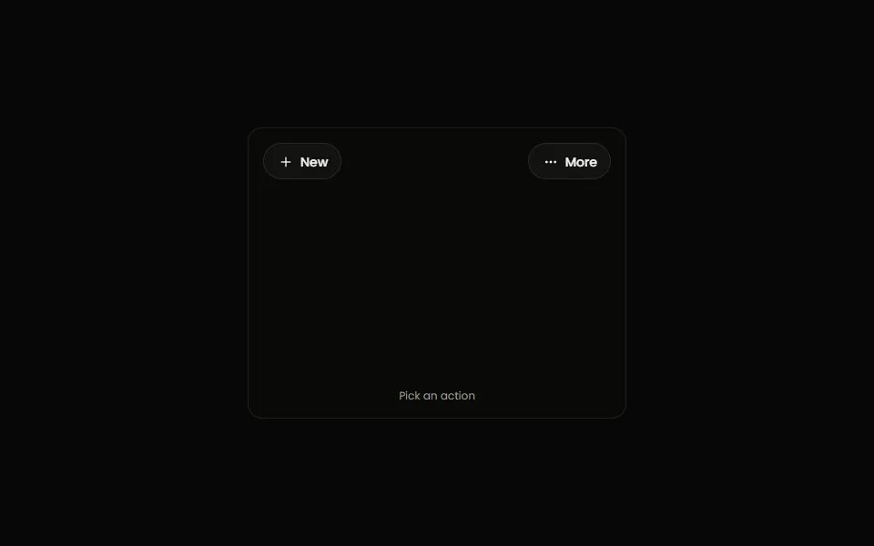
New · Components
Bloom Menu
A button that blooms into its own menu: the pill stretches into a panel in place, the label fades into the actions, and it folds back when you pick one. Arrow keys, Home/End and Escape work.
New · Components
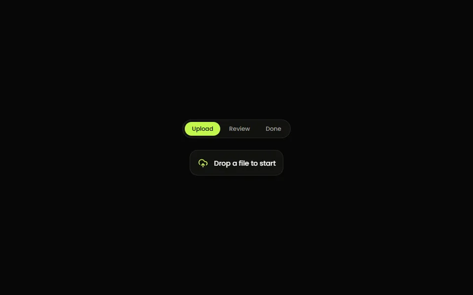
Size Shift
A box that glides to the size of whatever is inside it. Swap the content and the card eases to its new width and height on a spring while the new content fades up from a blur.
New · Micro Interactions
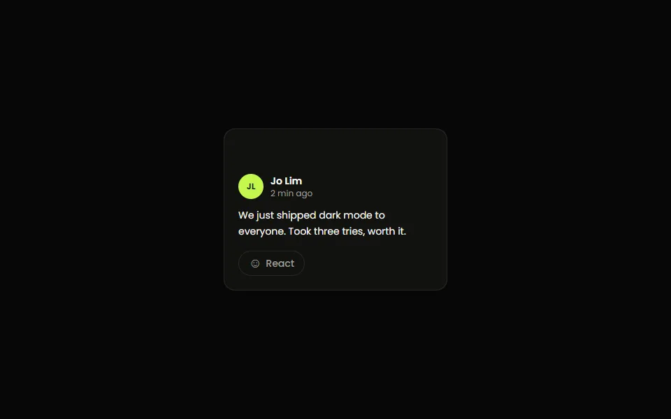
Reaction Bar
A reaction button whose emoji tray springs open on hover or click. The emoji under the pointer lifts and names itself, and the one you pick pops onto the button. Arrow keys and Escape work.
New · Components
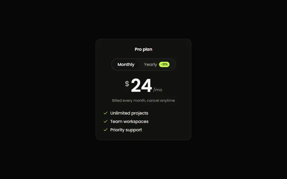
Price Toggle
A monthly / yearly pricing switch: the thumb slides between periods, the saving badge pops, and each digit of the price rolls to its new value, up when it rises and down when it drops.
New · Widgets & Mascots
Goal Ring
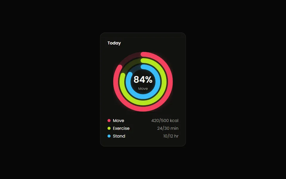
Concentric progress rings that fill when they scroll into view, each a beat after the last, while the center counts up to the outer ring's percent. With a legend.
Three Ways In, Same Result
Copy one file, install with the CLI, or start from a preset and change it. You always end up owning the code.
- 01
Copy the file
No setup. Open a component, copy its source, paste it into your project.
Browse componentscomponents/ui/tilt-card.tsx
export function TiltCard({ maxTilt = 12, glare = true,}: TiltCardProps) { … }
- 02Most popular
Install with the CLI
One command adds the file and any npm packages it needs.
Set up the CLIterminal
$npx shadcn@latest add \ @glint-ui/tilt-card✓Created tilt-card.tsx
- 03
Make it yours
Change props, classes or the code itself. It follows your shadcn theme.
Read the docsapp/page.tsx
<TiltCard maxTilt={18} className="rounded-3xl"> …</TiltCard>
Build Your Command Before You Install
Pick a few components and a package manager. Copy the line, paste it in your terminal.
Which components do you need?
Which package manager?
Your install command
npx shadcn@latest add@glint-ui/frost-tiles@glint-ui/letter-rise
- Components
- 2
- npm packages
- None
- Files added
- 2 in components/ui
The shadcn CLI copies each file into your project, where you can read and change it. Setup guide
Stop shipping static interfaces.
Copy a component, paste it in, make it yours. Free, open source, no package to keep updated.